Code
import numpy as np

N = 10

np.random.seed(1234)

x = np.random.randn(N,1) * 0.8

y = np.sin(3*x) + np.random.randn(N,1) * 0.09

xs = np.linspace(-3,3,61).reshape(-1,1)A Blog Entry on Bayesian Computation by an Applied Mathematician
$$
$$
Gauss 過程を用いた推論を実行するライブラリには,Matlab パッケージである GPML や,Python における GPy がある.

データ \(x_1,\cdots,x_{N},N=100\) として,\(\mathrm{N}(0,0.8^2)\) に従う乱数を用意する.これに対して, \[ y_i=\sin(3x_i)+\epsilon, \] \[ \epsilon\sim\mathrm{N}(0,0.09^2), \] を通じて \(y_1,\cdots,y_N\) を生成する.
import numpy as np
N = 10
np.random.seed(1234)
x = np.random.randn(N,1) * 0.8
y = np.sin(3*x) + np.random.randn(N,1) * 0.09
xs = np.linspace(-3,3,61).reshape(-1,1)この非線型関数 \(\sin\) を,Gauss 過程回帰がどこまで復元できるかが実験の主旨である.
GPy を用いた場合GPy を用いて Gauss 過程回帰を行うには,GPy.models.gp_regression モジュールの GPRegression クラス
class GPRegression(X, Y, kernel=None, Y_metadata=None, normalizer=None, noise_var=1.0, mean_function=None)を用いる.ソースコードは こちら.
引数のカーネル kernel は PGPy kernel オブジェクトを取り,デフォルトは rbf カーネルである.我々も RBF カーネル を用いることとする.これは GPy パッケージでは GPy.kern.src.rbf モジュールの RBF クラスで提供されている:
class RBF(input_dim, variance=1.0, lengthscale=None, ARD=False, active_dims=None, name='rbf', useGPU=False, inv_l=False)ソースコードは こちら.
モデルオブジェクトを初期化した後は次のように進む
optimize メソッド でハイパーパラメータを最適化する.
optimize(optimizer=None, start=None, messages=False, max_iters=1000, ipython_notebook=True, clear_after_finish=False, **kwargs)これはインスタンスの self.log_likelihood と self.log_likelihood_gradient を用いて,負の対数尤度を最小化する形で行われる.
predict メソッド でテスト点での予測を行う.
predict(Xnew, full_cov=False, Y_metadata=None, kern=None, likelihood=None, include_likelihood=True)返り値は事後平均と事後分散を numpy.ndarray として返す.
matplotlib を用いて予測の結果をプロットする.
import GPy
import matplotlib.pyplot as plt

kernel = GPy.kern.RBF(input_dim=1, variance=1.0)
model = GPy.models.GPRegression(x, y, kernel)

model.optimize()
mu, var = model.predict(xs)

# テスト点での平均と95%信頼区間のプロット
upper = mu + 1.96*np.sqrt(var)
lower = mu - 1.96*np.sqrt(var)
plt.fill_between(xs[:,0], lower[:,0], upper[:,0], color='lightgray', label='95% confidence interval', alpha=0.5)
plt.plot(xs, mu, label='Predicted mean')
plt.scatter(x, y, c='r', label='Observations', s=10)
plt.legend()

plt.show()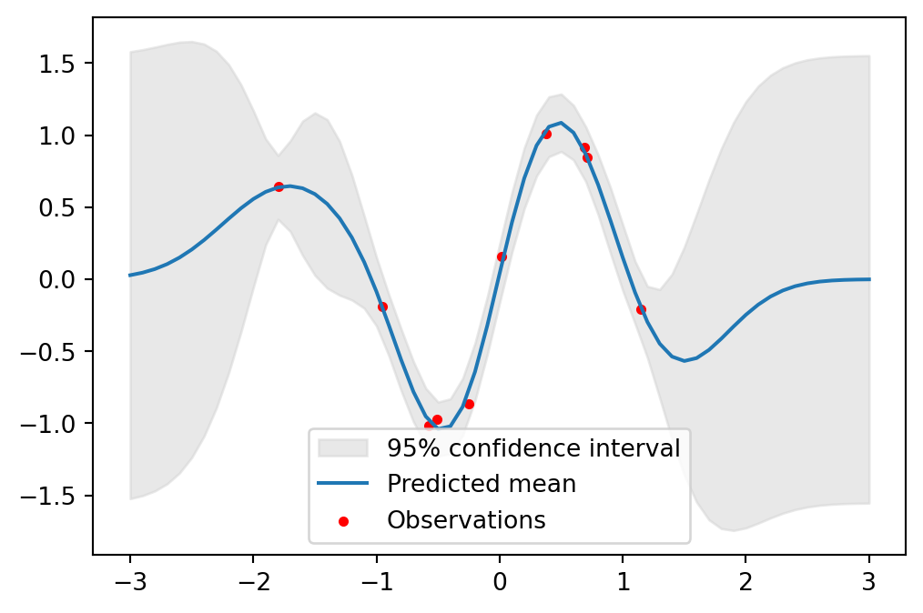
import numpy as np
import GPy
import matplotlib.pyplot as plt

kernel = GPy.kern.RBF(input_dim=1, variance=1.0)
model = GPy.models.GPRegression(x, y, kernel)
model.optimize()

xs = np.linspace(x.min(), x.max(), 1000)[:, None]
mu, var = model.predict(xs)

upper = mu + 1.96 * np.sqrt(var)
lower = mu - 1.96 * np.sqrt(var)

fig, ax = plt.subplots(figsize=(6, 4))  # グラフサイズを小さく

# 背景を白に
ax.set_facecolor('white')

# グラフ領域を削除
ax.patch.set_visible(False)

# 軸を細く
ax.spines['bottom'].set_linewidth(0.5)
ax.spines['left'].set_linewidth(0.5)

# メモリを非表示
ax.tick_params(axis='both', which='both', length=0, labelleft=False, labelbottom=False, left=False, bottom=False)

# 軸ラベルを削除
ax.set_xlabel('')
ax.set_ylabel('')

# 凡例を非表示
ax.legend().set_visible(False)

# データプロット
ax.fill_between(xs[:, 0], lower[:, 0], upper[:, 0], color='lightgray', alpha=0.5)
ax.plot(xs[:, 0], mu[:, 0], color='k', lw=1)
ax.scatter(x[:, 0], y[:, 0], c='b', s=30)

plt.tight_layout(pad=0.2)
plt.show()
/var/folders/gx/6w78f6997l5___173r25fp3m0000gn/T/ipykernel_9031/3363038710.py:35: UserWarning:No artists with labels found to put in legend. Note that artists whose label start with an underscore are ignored when legend() is called with no argument.
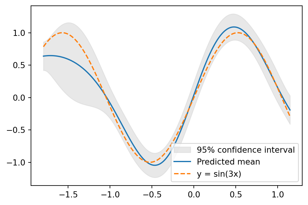
特に \([-2,2]\) の区間において,元の関数 \(\sin\) をよく復元できていることが分かる.実際,\(y=\sin(3x)\) と重ねてプロットすると次の通り:
scikit-learn を用いた場合scikit-learn における Gauss 過程回帰
このような単純な解析では,scikit-learn と用いるとより同じ分析が実行できる.
from sklearn.gaussian_process import GaussianProcessRegressor
from sklearn.gaussian_process.kernels import RBF, ConstantKernel as C
import numpy as np
import matplotlib.pyplot as plt

kernel = C(1.0, (1e-3, 1e3)) * RBF(10, (1e-2, 1e2))

gp = GaussianProcessRegressor(kernel=kernel, n_restarts_optimizer=10, alpha=0.1)

# モデルの学習
gp.fit(x, y.ravel())

mu, s2 = gp.predict(xs, return_std=True)

# テスト点での平均と95%信頼区間のプロット
plt.fill_between(xs.ravel(), mu - 1.96 * s2, mu + 1.96 * s2, color='lightgray', label='95% confidence interval', alpha=0.5)
plt.plot(xs, mu, label='Predicted mean')
plt.scatter(x, y, c='r', label='Observations', s=10)
plt.legend()
plt.show()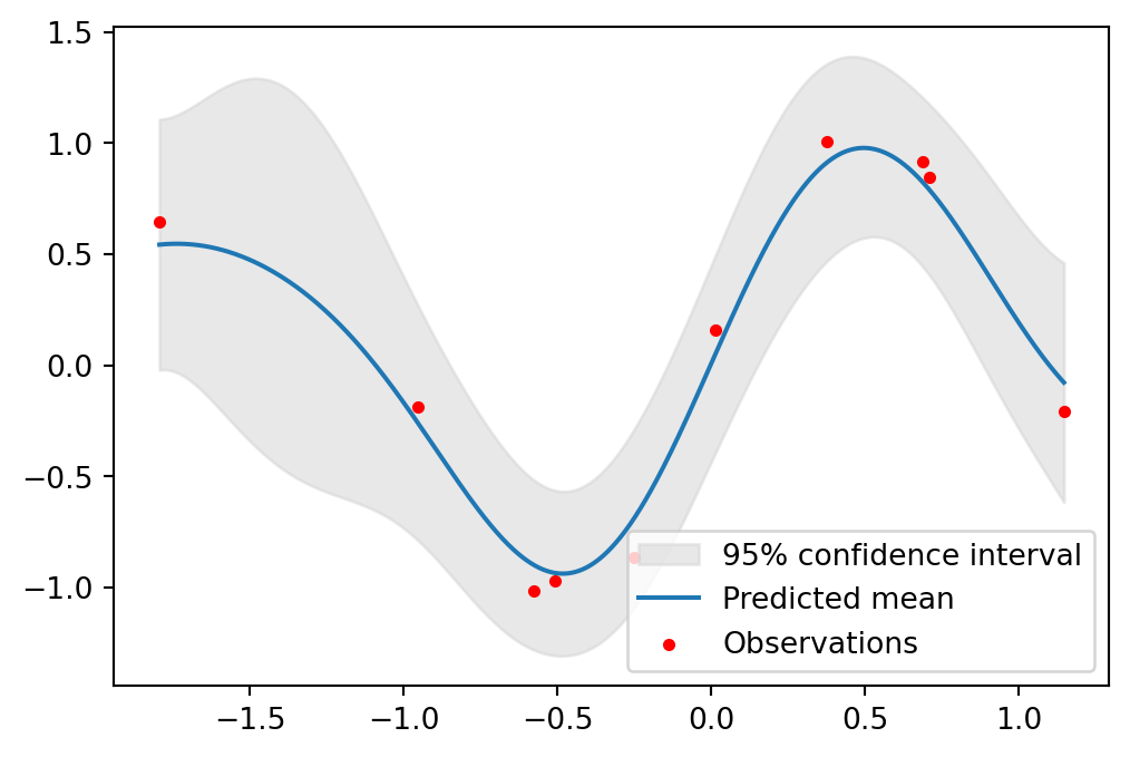
本質的には Gauss 過程回帰と変わらないが,回帰の場合と変え得る.
ここでは, \[ m_1:=\begin{pmatrix}3/4\\0\end{pmatrix},\quad m_2:=\begin{pmatrix}-3/4\\0\end{pmatrix}, \] \[ \Sigma_1:=\begin{pmatrix}1&0\\0&1\end{pmatrix},\quad\Sigma_2:=\begin{pmatrix}1&0.95\\0.95&1\end{pmatrix}, \] とし,\(\mathrm{N}_2(m_1,\Sigma_1)\) から \(n_1:=320\) データ,\(\mathrm{N}_2(m_2,\Sigma_2)\) から \(n_2:=160\) データを生成する:
n1, n2 = 320, 160
S1 = np.eye(2)
S2 = np.array([[1, 0.95], [0.95, 1]])
m1 = np.array([0.75, 0])
m2 = np.array([-0.75, 0])
x1 = np.random.multivariate_normal(m1, S1, n1)
x2 = np.random.multivariate_normal(m2, S2, n2)
x = np.vstack((x1, x2))
y1 = -np.ones(n1)
y2 = np.ones(n2)
y = np.concatenate((y1, y2)).reshape(-1,1)
plt.plot(x1[:, 0], x1[:, 1], 'o', label='Class 1')
plt.plot(x2[:, 0], x2[:, 1], '*', label='Class 2')
plt.legend()
plt.show()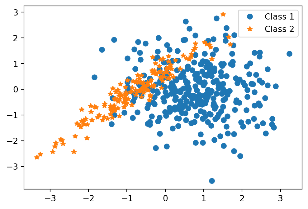
\(n_1:n_2=2:1\) であるから,このデータは Gauss 混合モデル \[ \frac{2}{3}\phi(x;m_1,\Sigma_1)+\frac{1}{3}\phi(x;m_2,\Sigma_2) \tag{1}\] からのデータと見れる.ただし,\(\phi(x;m,\Sigma)\) は \(\mathrm{N}_2(\mu,\Sigma)\) の密度関数とした.
サンプリング点は \([-4,4]^2\) 内の幅 \(0.1\) の格子点とする:
t1, t2 = np.meshgrid(np.arange(-4, 4.1, 0.1), np.arange(-4, 4.1, 0.1))
t = np.column_stack([t1.flat, t2.flat])
点 \(x\) でモデル 1 からのデータが観測されたとき,これがクラス \(1,2\) からのものである確率 \(p_1,p_2\) は \[ \begin{align*} p_1&=\frac{n_1}{n_1+n_2}\phi(x;m_1,\Sigma_1)\\ &=\frac{1}{2\pi(n_1+n_2)}\cdot n_1\frac{e^{-\frac{1}{2}(x-m_1)^\top\Sigma_1^{-1}(x-m_1)}}{\sqrt{\det\Sigma_1}} \end{align*} \] \[ p_2= \frac{1}{2\pi(n_1+n_2)}\cdot n_2\frac{e^{-\frac{1}{2}(x-m_2)^\top\Sigma_2^{-1}(x-m_2)}}{\sqrt{\det\Sigma_2}} \] である.
よって,\(x\in[-4,4]^2\) がクラス \(2\) からのものである確率を,等高線 (contour) としてプロットすると,次の通りになる:
invS1 = np.linalg.inv(S1)
invS2 = np.linalg.inv(S2)
detS1 = np.linalg.det(S1)
detS2 = np.linalg.det(S2)

tmm1 = t - m1
p1 = n1 * np.exp(-0.5 * np.sum(tmm1.dot(invS1) * tmm1, axis=1)) / np.sqrt(detS1)

tmm2 = t - m2
p2 = n2 * np.exp(-0.5 * np.sum(tmm2.dot(invS2) * tmm2, axis=1)) / np.sqrt(detS2)

posterior = p2 / (p1 + p2)

# 等確率等高線のプロット
contour_levels = np.arange(0.1, 1, 0.1)
plt.contour(t1, t2, posterior.reshape(t1.shape), levels=contour_levels)

# データポイントのプロット
plt.plot(x1[:, 0], x1[:, 1], 'o', label='Class 1', alpha=0.5)
plt.plot(x2[:, 0], x2[:, 1], '*', label='Class 2', alpha=0.5)
plt.legend()
plt.show()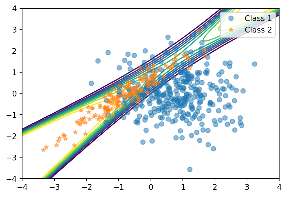
平均は \(0\) とし,共分散関数は 関連度自動決定 (ARD: Autonatic Relevance Determination) (MacKay, 1994), (Neal, 1996, p. 16) を用いる.
これは,2つの入力 \(x_1,x_2\) が異なる重要度を持つ場合,それぞれの入力に対するスケールパラメータを導入する手法である.
これは,GPy.kern.RBF 関数のキーワード引数 ARD=True を通じて実装できる:
import time

start_time = time.time()

meanfunc = GPy.mappings.Constant(2,1)
kernel = GPy.kern.RBF(input_dim=2, ARD=True)

model = GPy.models.GPClassification(x, y, kernel=kernel, mean_function=meanfunc)
model.optimize()

# テストデータセットに対する予済分布の計算
y_pred, _ = model.predict(t)

end_time = time.time()

# 予測確率の等高線プロット
plt.figure(figsize=(8, 6))
plt.plot(x1[:,0], x1[:,1], 'o', label='Class 1', alpha=0.5)
plt.plot(x2[:,0], x2[:,1], '*', label='Class 2', alpha=0.5)
contour = plt.contour(t1, t2, y_pred.reshape(t1.shape), levels=np.linspace(0, 1, 10))
plt.clabel(contour, inline=1, fontsize=10)
plt.legend()
plt.show()

elapsed_time = end_time - start_time
print(f"実行時間: {elapsed_time:.1f} 秒")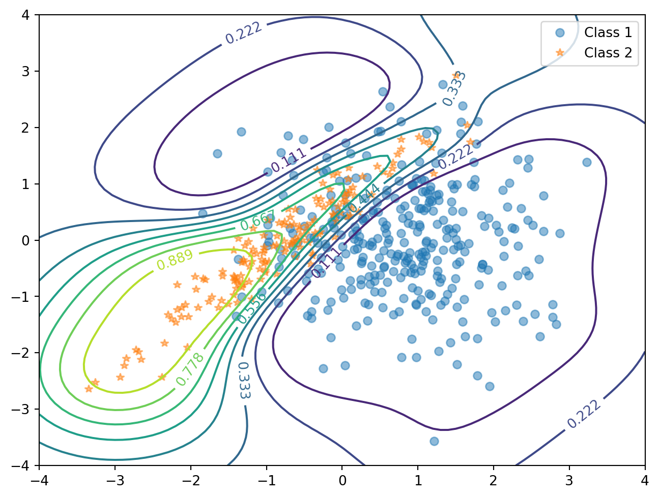
実行時間: 14.3 秒図 1 の真の構造の特徴を捉えていることが判る.
Documentation for GPML Matlab Code version 4.2 3c 節を参考にした.↩︎
Documentation for GPML Matlab Code version 4.2 4e 節を参考にした.↩︎